

Key points
- This guide shows how to line up several images in one row in Divi.
- Set up the section in the Divi Builder first.
- Add a custom CSS class to the row and the code in Theme Options.
- Check the layout on different devices afterwards.
In this article5 sectionsHideShow
How to align multiple images horizontally in a single row on WordPress with Divi
This quick guide will walk you through how to align images next to each other in a single row.
Prerequisites
Ensure you’re ready with:
- A WordPress website with Divi Theme installed.
- Basic familiarity with Divi Builder.
- Some understanding of HTML and CSS for tweaks beyond Divi’s built-in options.
Step 1: setting up your section in Divi Builder
Start by logging into your WordPress dashboard and navigating to the page where you want to add the text and image section. Open the page in Divi Builder.
- Add a New Section: Click on the blue plus button to add a new section and select "Regular" from the options.
- Insert a Row: Choose a row structure.
- Add Image Modules: In the single column, add a "image" module.
Step 2: applying custom CSS class to the row you want to align the images in
To apply custom CSS:
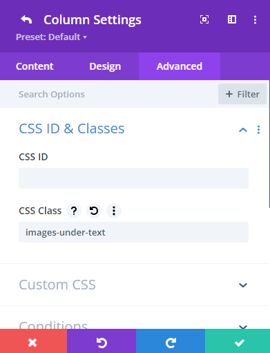
- Go to Row Settings: Click on the cog icon on the row you want to use.
- Click Advanced Tab: Here click CSS ID & Classes, then copy and page "images-under-text" in the CSS Class as shown in the picture below.
images-under-text
Step 3: applying the custom CSS code to your Theme Options
Now for it to work whenever you want to use it in a CSS Class go to theme options custom CSS:
- Go to the wordpress admin page: Click on DIVI, then theme options.
- Scroll down to custom CSS: Then copy and page this code to align three images underneath a text box or edit it to align images as you see fit.
.images-under-text .et_pb_image {
  display: inline-block; /* Aligns the image modules side by side */
  width: 33.33%; /* Each image takes up one-third of the row */
  vertical-align: top; /* Ensures images align at their tops if they have different heights */
  box-sizing: border-box; /* Includes padding and border in the element's total width and height */
}
.images-under-text .et_pb_text {
  width: 100%; /* Ensures the text module spans the full width of the row */
  margin-bottom: 20px; /* Adds space between the text and the images */
}
Free call
Want more enquiries from Google?
Book a free call and we'll look at your site with you, then show you what's holding it back.
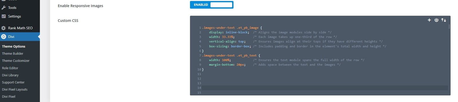
This CSS ensures each image uses the full width of each column and aligns them correctly.
Step 4: review and adjust responsiveness
Divi is designed to be responsive, but checking how your new layout looks on different devices is a good practice. Use Divi’s built-in visual builder to toggle between desktop, tablet, and mobile views, making adjustments as needed.
- Adjusting for Mobile: If the images look too small on mobile, consider setting them to stack vertically rather than horizontally. You can easily adjust this under the Design tab for each image module by changing the width and overriding global settings on mobile views.
Step 5: save and preview your page
Once you’re satisfied with how everything looks, don’t forget to save your changes. Click the green Save button, then preview the page to ensure everything looks as expected in a live environment.
Final thoughts
Styling a text and image section using Divi Builder provides both flexibility and power, allowing you to create professional and appealing layouts without extensive coding knowledge. Remember, the key to a successful layout in Divi lies in balancing custom CSS with the robust options that Divi already provides. Experiment with different designs and configurations to see what works best for your content and aesthetic preferences. Happy designing!